
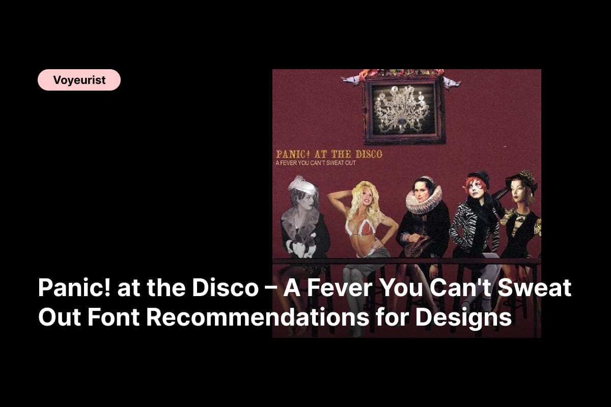
Panic! at the Disco – A Fever You Can’t Sweat Out font recommendations are deeply rooted in drama, emotion, and theatrical storytelling. This iconic debut album is more than just a collection of songs—it is a carefully staged performance filled with Victorian flair, emo confessionals, and cabaret-style intensity. From its lyrical themes to its visual identity, the album demands typography that feels expressive, ornamental, and unapologetically bold.
As a music album, A Fever You Can’t Sweat Out blends sharp emotional contrasts. It moves between elegance and chaos, romance and rebellion, humor and heartbreak. Translating this complex sound into visual form requires fonts that carry personality, texture, and a sense of performance. Typography becomes the voice that visually sings alongside the music.
Designers working with concepts inspired by Panic! at the Disco – A Fever You Can’t Sweat Out often lean into vintage aesthetics, hand-drawn details, and dramatic letterforms. These choices help communicate the album’s theatrical DNA and emotional weight. In this article, we explore curated fonts that align with that unique identity and elevate album artwork, posters, merch, lyric visuals, and emo-inspired branding.
Why Typography Is Essential for A Fever You Can’t Sweat Out
The visual world of A Fever You Can’t Sweat Out feels like a stage set frozen in time. Influenced by Victorian posters, vaudeville flyers, and antique playbills, the album’s aesthetic thrives on ornate details and emotional exaggeration. Typography plays a leading role in building this atmosphere.
The right font choice helps designers:
- Convey emotional intensity and lyrical drama
- Reinforce vintage and theatrical storytelling
- Create contrast between elegance and raw expression
- Develop a strong visual identity tied to emo culture
The following Panic! at the Disco – A Fever You Can’t Sweat Out font recommendations are selected for their ability to channel those qualities while remaining flexible for modern design applications.
Panic! at the Disco – A Fever You Can’t Sweat Out Font Recommendations
1. CS Misley Drawn
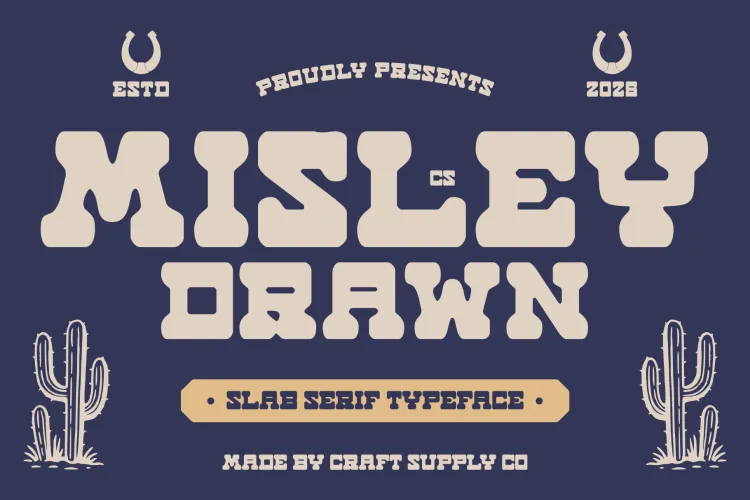
CS Misley Drawn offers a raw, emotional, hand-drawn style that feels personal and unfiltered. Its imperfect strokes echo the confessional lyrics and chaotic emotions found throughout the album. This font works beautifully for lyric graphics, album-inspired posters, and expressive headlines.
2. CS Misley Slab Serif
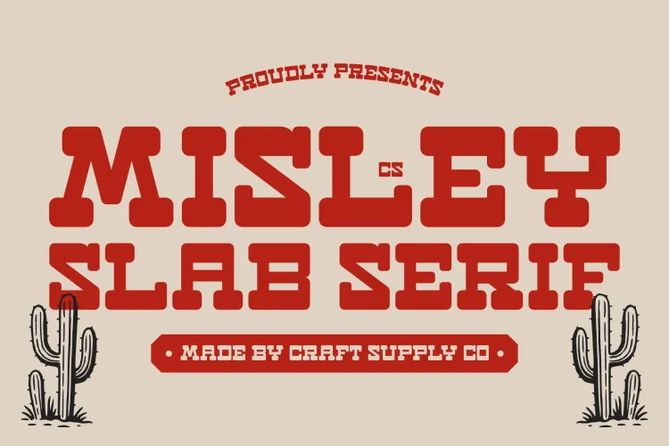
This slab serif version of Misley balances structure with character. It maintains a vintage tone while improving readability, making it ideal for longer titles, editorial layouts, and theatrical branding that still requires clarity.
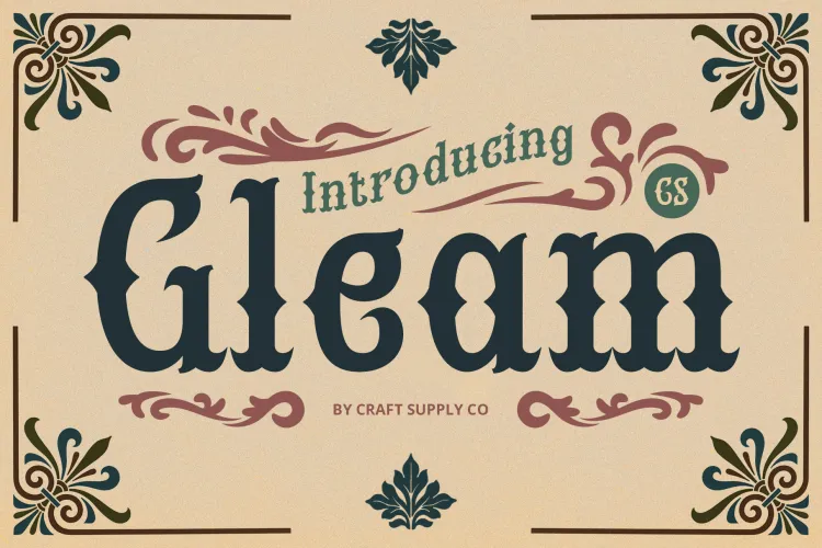
3. CS Gleam Drawn
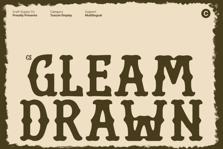
CS Gleam Drawn features dramatic curves and handcrafted character. Its expressive style suits ornate compositions and reflects the cabaret-inspired visuals associated with Panic! at the Disco – A Fever You Can’t Sweat Out.
4. Velton Pixel
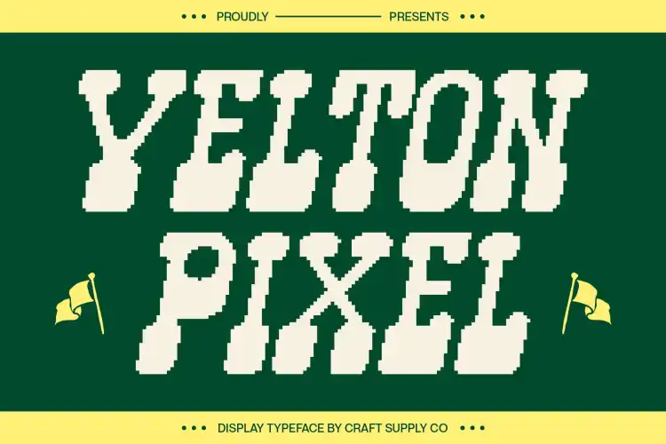
Velton Pixel introduces a subtle digital contrast into otherwise vintage-heavy visuals. This font works well for experimental designs, adding tension between modern emo culture and old-world theatrical influences.
5. CS Bourne Drawn Font
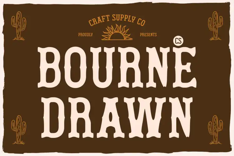
CS Bourne Drawn feels intimate and expressive, as if written backstage before a performance. Its sketch-like style is similar to, Panic! at the Disco – A Fever You Can’t Sweat Out.
6. CS Blouse Reverse Contrast Font
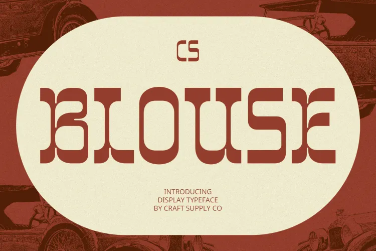
This reverse-contrast font delivers dramatic elegance with a rebellious edge. Its thick-and-thin strokes reference Victorian-era typography and circus posters, aligning perfectly with the theatrical mood of the album.
7. CS Courage Retro Font
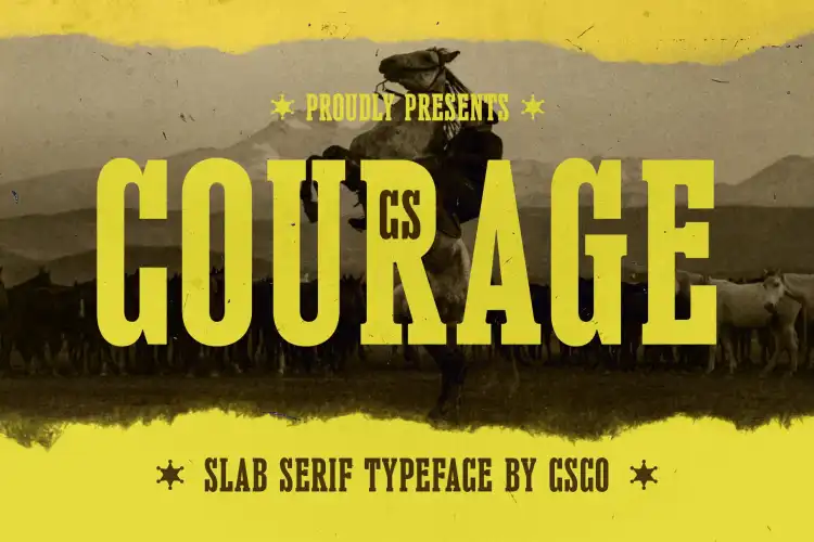
CS Courage brings bold retro confidence to any composition. Inspired by vintage signage, it pairs well with ornate fonts and works especially well for merch, tour posters, and bold typographic statements.
8. CS Boxing Retro Font
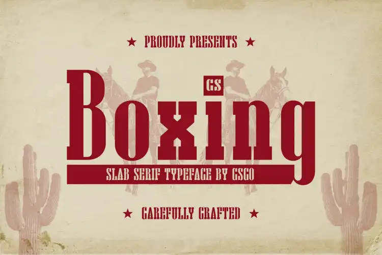
CS Boxing Retro is strong, assertive, and grounded. It provides balance when paired with decorative fonts, offering structure and contrast within dramatic, emotion-heavy layouts.
9. CS Gleam Tuscan Font
This Tuscan-style font draws heavily from 19th-century type design. Its ornate serifs and rhythmic forms mirror, Panic! at the Disco – A Fever You Can’t Sweat Out. Victorian influence and theatrical storytelling approach.
10. Tigreal Rough Font
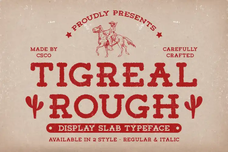
Tigreal Rough adds grit and texture through distressed letterforms. It reflects the emotional rawness beneath the album’s polished theatrics, making it ideal for darker, mood-driven compositions.
Design Tips for Fever-Inspired Typography
To maximize the impact of these Panic! at the Disco – A Fever You Can’t Sweat Out font recommendations, designers should focus on contrast and balance. Decorative fonts should lead the visual narrative, while simpler fonts support readability.
- Use ornate fonts for album titles and headlines
- Pair drawn or rough fonts with clean body text
- Apply vintage color palettes such as sepia, burgundy, and muted gold
- Incorporate texture and negative space to enhance drama
Panic! at the Disco – A Fever You Can’t Sweat Out font recommendations revolve around emotion, performance, and vintage theatrical flair. These fonts translate music into visual storytelling, allowing designers to capture the album’s iconic blend of elegance and chaos.
Whether you are creating album artwork, lyric visuals, posters, or emo-inspired branding, these fonts provide a powerful typographic foundation that honors the dramatic spirit. Explore more from voyeurist.


