
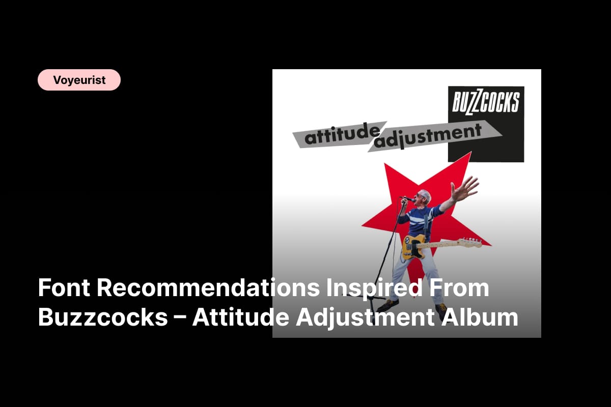
Buzzcocks – Attitude Adjustment font recommendations are driven by urgency, rebellion, and unapologetic confidence. As a music album, Attitude Adjustment reflects the Buzzcocks’ sharp-edged punk legacy while embracing direct messages, political tension, and no-nonsense songwriting. The album feels loud, fast, and confrontational, and its typography should communicate that same intensity at first glance.
Punk music has always relied heavily on visual identity. From DIY flyers to photocopied zines and bold album covers, typography has played a crucial role in shaping how punk is perceived. For Buzzcocks – Attitude Adjustment, fonts need to be strong, legible, and assertive. Clean lines, bold weights, and condensed forms work especially well to reflect urgency and attitude without unnecessary ornament.
This article explores carefully selected fonts that align with the bold and rebellious nature of Buzzcocks – Attitude Adjustment. These typefaces are ideal for album artwork, tour posters, merchandise, playlists, and modern punk-inspired branding where clarity and impact matter most.
The Importance of Typography in Buzzcocks – Attitude Adjustment
The visual language of punk is rooted in confrontation. It rejects softness and embraces boldness. Typography inspired by Attitude Adjustment should feel immediate, stripped-down, and powerful. Sans serif fonts, especially bold and condensed styles, have long been associated with punk graphics because they deliver messages quickly and without distraction.
The right typography helps designers:
- Communicate rebellion and independence instantly
- Create strong visual hierarchy with minimal elements
- Maintain high readability in loud, energetic layouts
- Build a modern punk identity without losing authenticity
The following Buzzcocks – Attitude Adjustment font recommendations are selected for their strength, attitude, and adaptability in high-energy design projects.
Font Recommendations Inspired by Buzzcocks – Attitude Adjustment
1. Godger Condensed Sans Serif
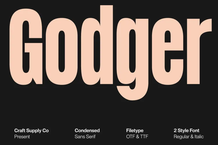
Godger Condensed delivers tight spacing and strong vertical emphasis. Its condensed structure makes it perfect for punk posters, album titles, and headlines that need to feel urgent and uncompromising.
2. Arnel Bold Sans Serif
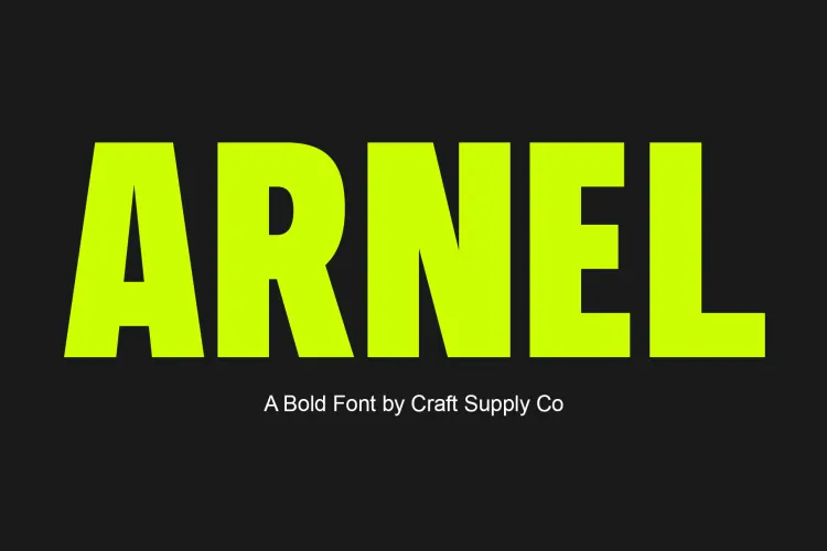
Arnel Bold Sans Serif is clean, modern, and forceful. Its solid construction makes it ideal for bold statements, political messages, and graphic layouts inspired by punk’s direct communication style.
3. Arnel Rounded Bold Sans Serif
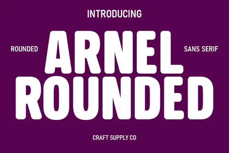
This rounded variation softens the edges slightly while maintaining strength. It works well for secondary headlines or merch designs where punk attitude meets accessibility.
4. Demine Wide Display Typeface
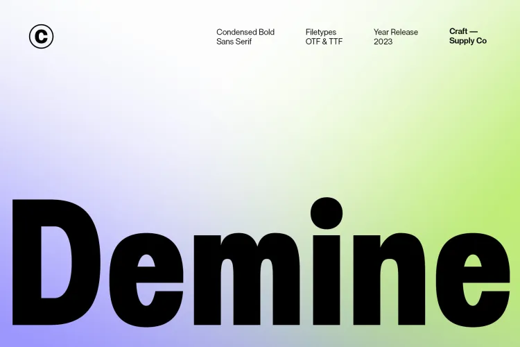
Demine Wide Display offers bold width and heavy presence. Its expansive letterforms create visual dominance, making it perfect for album covers and large-scale promotional graphics.
5. Maginer Quirky Display Font Family
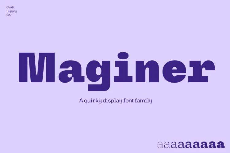
Maginer introduces a playful yet rebellious edge. Its quirky character adds personality while still fitting punk aesthetics, making it ideal for experimental layouts and zine-inspired visuals.
6. CS Guthen Bold Font
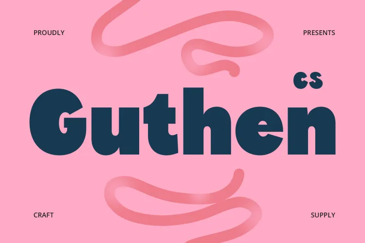
CS Guthen Bold Font feels assertive and modern. Its heavy strokes command attention and work well for slogans, album names, and impactful typographic compositions.
7. CS Legacy Bold Font
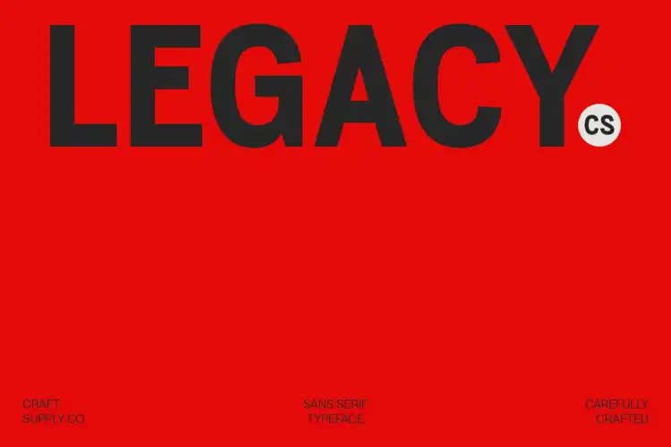
CS Legacy Bold balances classic structure with punk attitude. Its strong readability makes it suitable for both digital and print designs where clarity is essential.
8. Bamboly Bold Sans Serif
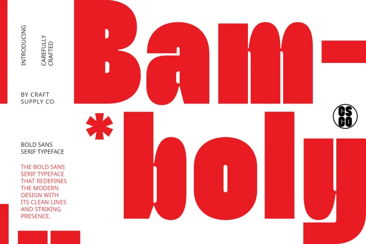
Bamboly Bold Sans Serif brings a slightly playful tone without losing impact. It works well for punk-inspired branding that leans into humor and irony.
9. CS Brigham Bold Font
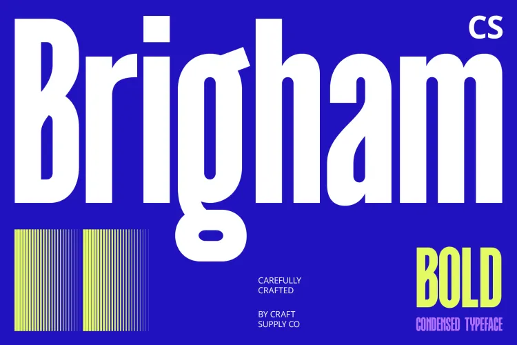
CS Brigham Bold Font delivers a contemporary feel with strong presence. It pairs well with minimal layouts and monochrome palettes common in punk design.
10. Bengal Retro Bold Sans Font
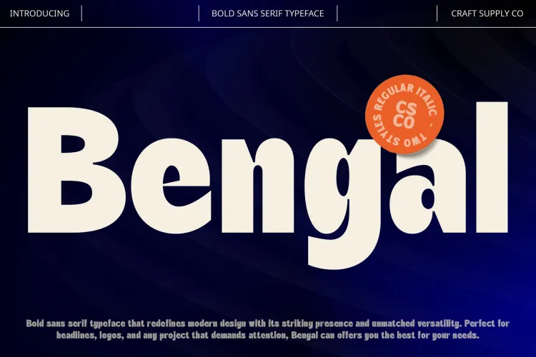
Bengal Retro Bold Sans Font adds a subtle retro influence while remaining bold and direct. It’s ideal for designs that reference punk history while staying visually fresh.
Design Tips for Punk-Inspired Typography
To maximize the impact of these Buzzcocks – Attitude Adjustment font recommendations, designers should focus on simplicity and contrast. Punk design thrives on bold choices and minimal decoration.
- Use bold sans serif fonts for headlines and slogans
- Limit color palettes to enhance contrast and aggression
- Experiment with scale to create visual tension
- Let typography lead the design without excessive imagery
Buzzcocks – Attitude Adjustment font recommendations emphasize strength, clarity, and rebellion. These fonts translate punk music into powerful visual language, allowing designers to create artwork that feels loud, fast, and unapologetic.
Whether you are designing album covers, tour posters, merchandise, or punk-inspired branding, these fonts provide a solid typographic foundation that reflects the raw energy and attitude of Attitude Adjustment. Explore more from voyeurist.


