
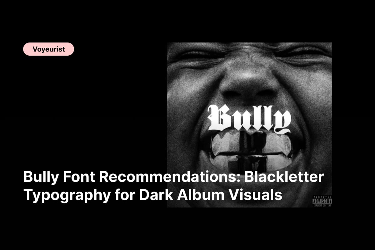
Ye – Bully font recommendations demand typography that feels confrontational, unapologetic, and visually dominant. If the album title Bully suggests anything, it is pressure, power, controversy, and raw emotional force. Ye’s artistic identity has always thrived on provocation, minimalism, and symbolic tension, and that same philosophy should guide the typographic direction for this album.
Blackletter typography is a natural fit for this aesthetic. Historically associated with authority, rebellion, religion, and dominance, blackletter fonts communicate intensity at first glance. They feel rigid yet expressive, traditional yet dangerous—perfect for visual narratives that challenge norms and command attention.
In this article, we explore curated Ye – Bully font recommendations built entirely around blackletter typefaces. These fonts are ideal for album covers, vinyl packaging, merchandise, poster art, fashion branding, and digital visuals that need to project power, conflict, and dark symbolism.
The Visual Language Behind Ye – Bully
Bully feels like a statement rather than a story. The title implies confrontation, dominance, and uncomfortable truth. That energy translates visually into stark contrasts, minimal color palettes, and typography that feels heavy and authoritative.
Blackletter fonts bring weight and tension. Their sharp strokes and dense forms instantly establish hierarchy and seriousness. Unlike modern sans serif fonts that aim for neutrality, blackletter fonts demand emotional reaction. They force the viewer to stop, look, and feel.
Typography for Bully should:
- Communicate dominance and intensity
- Feel symbolic rather than decorative
- Support minimal, high-contrast layouts
- Reflect power, conflict, and cultural weight
Font Recommendations Inspired by Ye – Bully
1. CS Enigma Blackletter Font
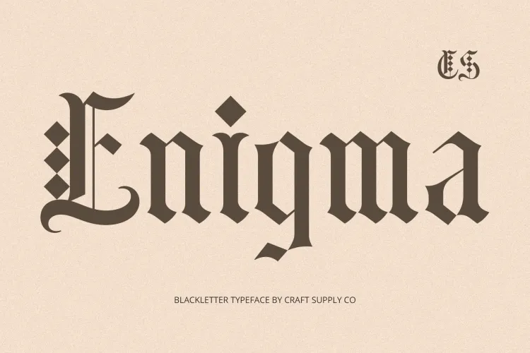
CS Enigma Blackletter Font delivers sharp authority and mysterious tension. Its angular construction makes it perfect for album titles and branding that need to feel cryptic, powerful, and symbolic.
2. CS Drusilla Blackletter Font
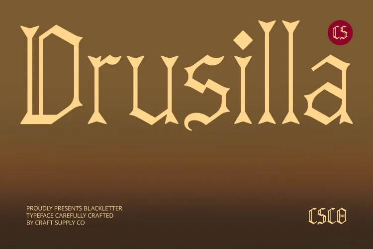
CS Drusilla Blackletter Font feels dramatic and unapologetic. Its bold vertical strokes reinforce dominance, making it ideal for statement-driven visuals and merchandise typography.
3. Cambrine Blackletter Font
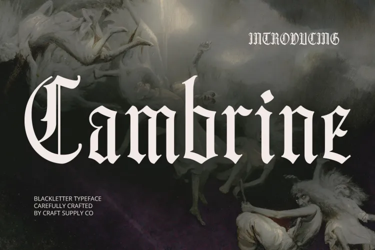
Cambrine Blackletter Font blends classic structure with modern clarity. It carries historical weight while remaining readable, which works well for large-format album artwork.
4. CS Salient Blackletter Font
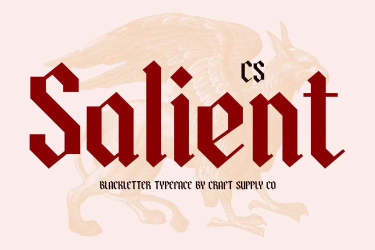
CS Salient Blackletter Font is assertive and clean. Its disciplined form supports minimalist layouts where typography becomes the main visual weapon.
5. CS Denisa Blackletter Font
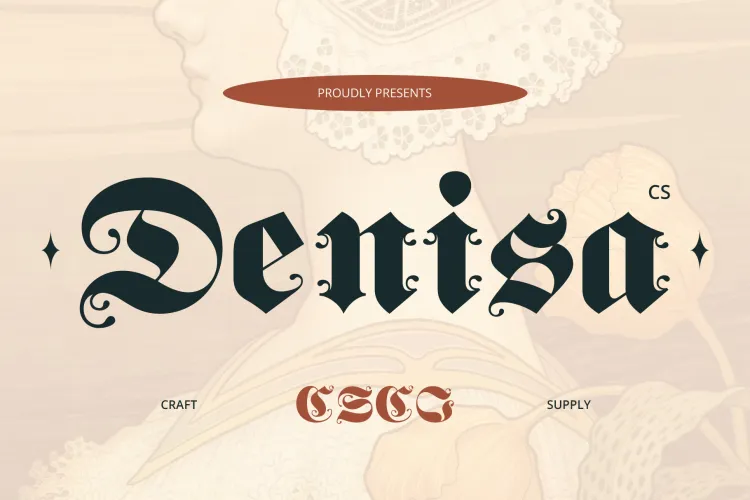
CS Denisa Blackletter Font feels ceremonial and intense. It works beautifully in dark compositions where symbolism and authority take center stage.
6. CS Crackle Blackletter Font
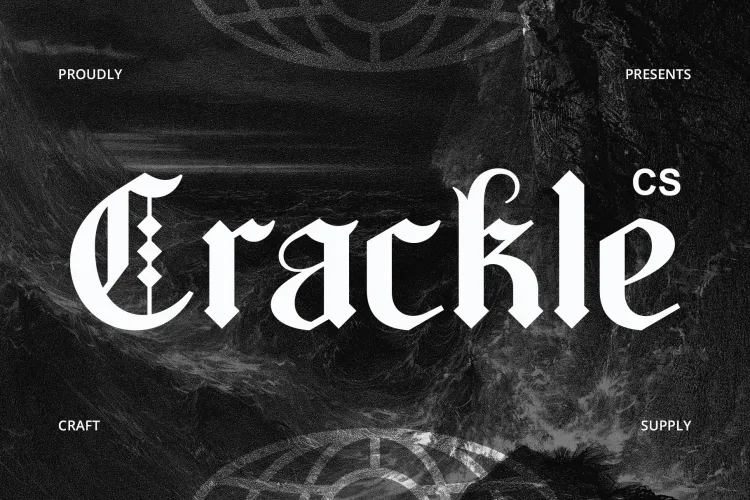
CS Crackle Blackletter Font introduces rough texture and chaos. Its distressed edges mirror emotional friction and internal conflict, aligning perfectly with the album’s confrontational tone.
7. CS Snapper Blackletter Font
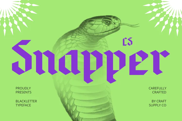
CS Snapper Blackletter Font feels sharp and aggressive. Its tight spacing and strong contrast make it ideal for bold headlines and visual dominance.
8. CS Brine Blackletter Font
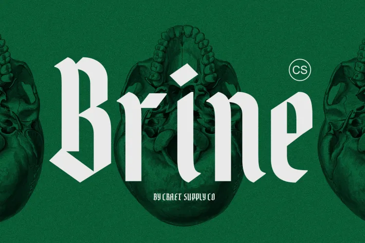
CS Brine Blackletter Font balances elegance and brutality. It brings a refined darkness that works well for fashion-driven visuals and conceptual album art.
9. CS Aither Blackletter Font
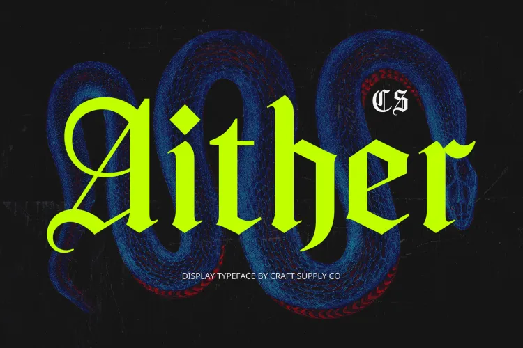
CS Aither Blackletter Font feels atmospheric and heavy. Its gothic structure adds emotional depth and visual gravity to dark-themed compositions.
10. CS Bergamot Blackletter Font
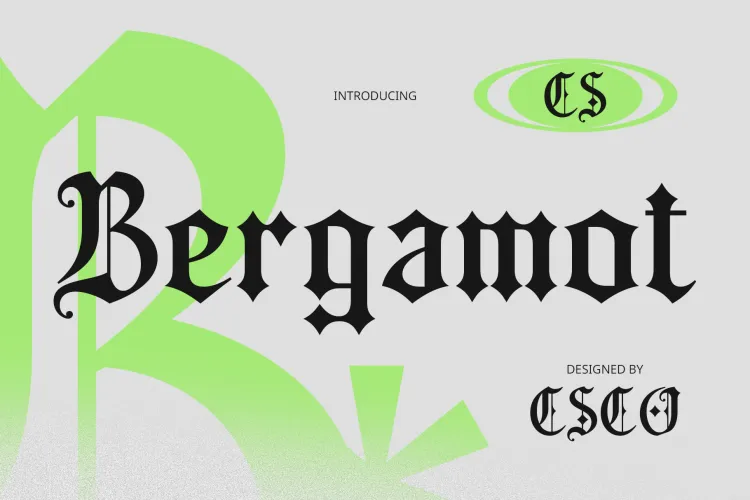
CS Bergamot Blackletter Font delivers bold clarity with traditional roots. It’s ideal for album titles that must feel timeless, confrontational, and unmistakably strong.
How to Design with Blackletter Typography
Using these Ye – Bully font recommendations effectively requires restraint and intention. Blackletter fonts are powerful on their own, so they should be given space to breathe.
- Use blackletter fonts primarily for titles and key phrases
- Pair with neutral sans serif fonts for supporting text
- Limit color palettes to black, white, and muted tones
- Embrace minimalism to let typography dominate
High contrast, strong alignment, and intentional spacing will amplify the emotional impact without overwhelming the viewer.
Ye – Bully font recommendations focus on blackletter typography that embodies power, conflict, and cultural weight. These fonts are not subtle—they are commanding, symbolic, and emotionally charged, much like the album itself.
Whether used for album artwork, fashion branding, posters, or digital visuals, these blackletter fonts provide a bold typographic foundation for designs that refuse to be ignored. When paired with minimal layouts and strong concepts, they turn words into statements. Explore more on voyeurist.


